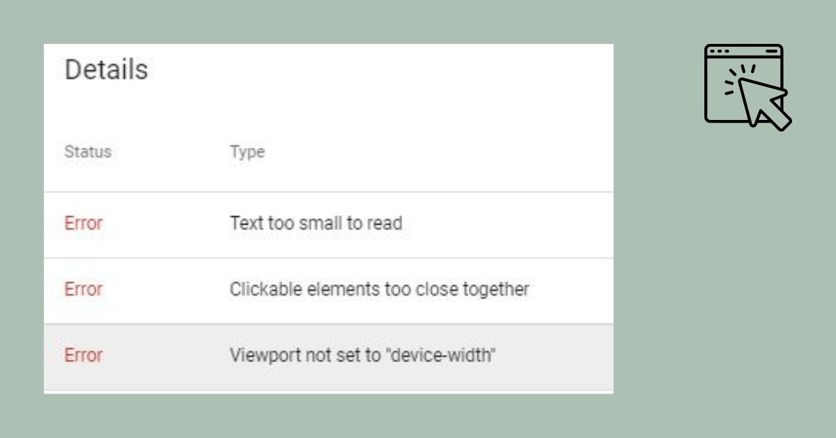
There are a few potential issues that could cause problems with the layout of your website on mobile devices, such as clickable elements being too close together or content being wider than the screen.
Clickable Elements Too Close Together
Here are a few things you can try to fix these issues:
- Ensure your website’s responsive design and adjust it to fit different screen sizes and resolutions. This can be achieved by using media queries in your CSS or a responsive WordPress theme.
- Check your images’ width and ensure they are manageable for mobile devices. If you have already reduced the size of your images to 640px, try reducing the size even further.
- Check for any coding errors or conflicts that could be causing problems with the layout of your website. This could include issues with your theme’s CSS or JavaScript files or with plugins that you have installed on your site.
- Use the Mobile-Friendly Test tool Google provides to check your website for mobile-friendliness. This tool will analyze your website and provide recommendations for improving its mobile-friendliness.
- If you are using Google Search Console (GSC) to monitor your website’s performance, check the “Mobile Usability” report for any issues that might affect your site’s mobile version.
I hope these suggestions help!
However, if you still have problems with your website’s mobile layout, you can contact us or consider consulting a web developer for further assistance.
[irp]


